Data visualization is a term used to describe any technology that lets end users understand information through a visual representation of the data. A simple example of data visualization would be the creation of a chart or graph from the data extracted from tables in an Excel spreadsheet. Today, technology allows data to be displayed in more sophisticated ways, allowing the user to manipulate the data through an interactive web-based application.
One example of visualization of OCDS Pilot data
The availability of the OCDS Pilot data means that businesses, using commercially available business intelligence products that enable data visualization, can analyze markets, and predict trends and requirements.
The following scenario is a simple example of how businesses can build market intelligence by using an interactive web-based application to manipulate and understand information found in the OCDS Pilot data file.
Scenario
An informatics professional services provider wants to do business with the federal government. They would like to know:
- Does PWGSC purchase these services?
- How many contracts have been issued by PWGSC?
- What has been the procurement trend for these services for the past few years?
Visualization possibilities
For this scenario, an open source community edition of Pentaho, a business intelligence tool, was used to integrate and manipulate the data. Using the application’s drag and drop functionality, the supplier can now determine:
- The number of contracts issued to procure these services.
- The procurement trend for these services over several fiscal years.
OCDS Pilot data visualization of procurement trend for informatics professional services
Table summary: The following bar graph represents the number of informatics professional services contracts issued by PWGSC over several fiscal years. Note that a fiscal year runs from April 1st to March 31st.
The data used to generate the graph is as follows:
- Fiscal year 2012-2013 - 22 contracts issued by PWGSC
- Fiscal year 2013-2014 - 11 contracts issued by PWGSC
- Fiscal year 2014-2015 - 4 contracts issued by PWGSC (to date)
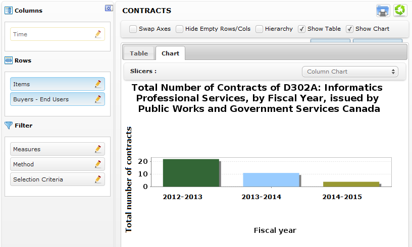
Source: PWGSC visualization using Pentaho application and OCDS Pilot data
Other examples of how Government of Canada open data can be used
Canada, as member of the Open Government Partnership, encourages Canadians to use Government of Canada open data to create useful web-based applications under the Open Government Licence. Visit the Government of Canada’s Apps Gallery to experience the many applications already developed by the Government of Canada and the public. Visitors to the site also have the opportunity to share applications they have created using Government of Canada open data.